

Bridging Faith,
Family, & Future.
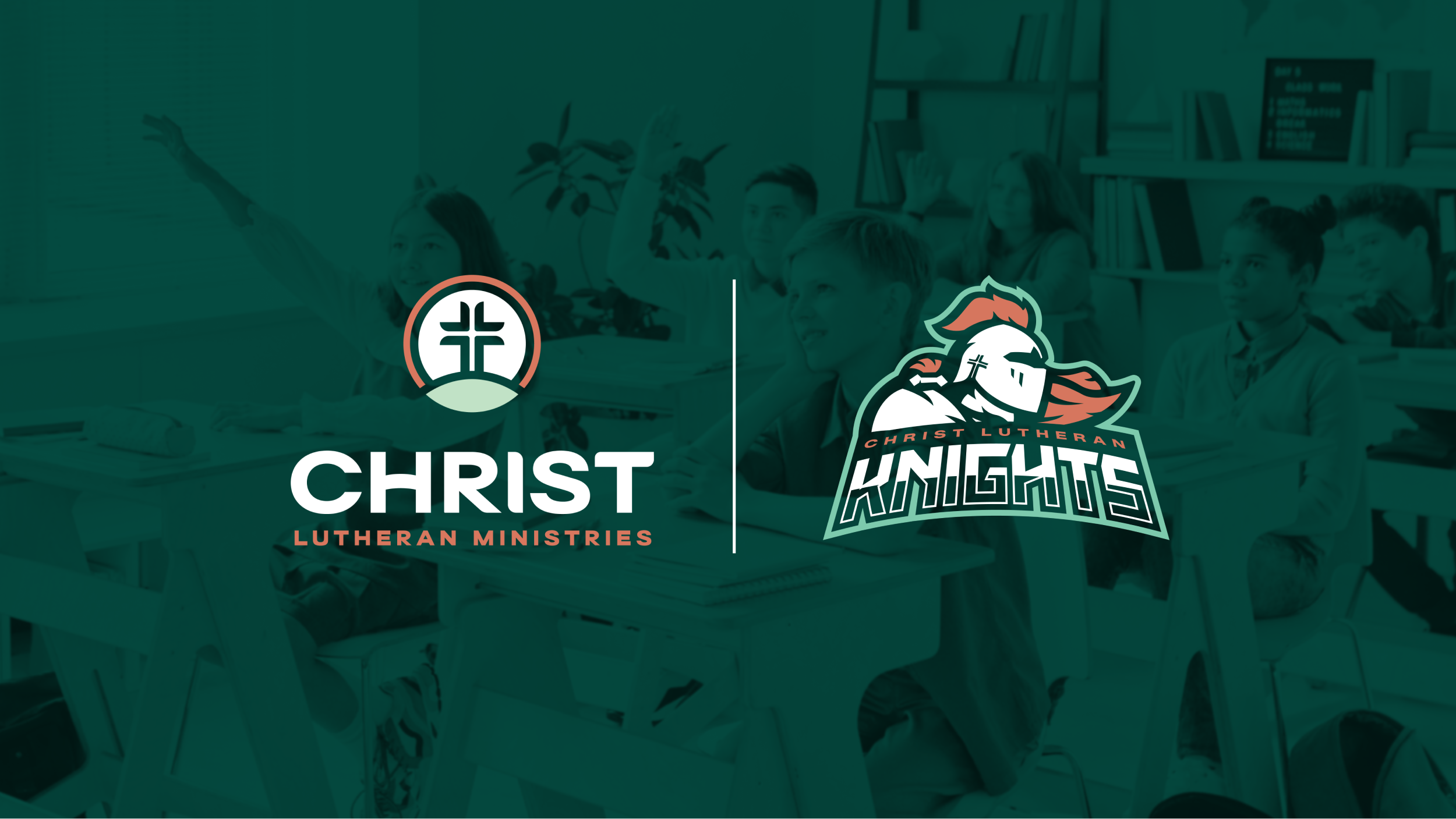
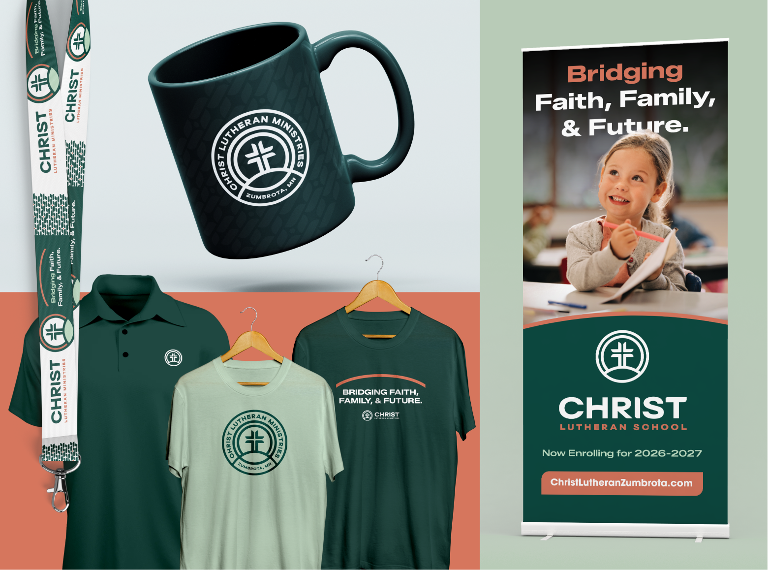
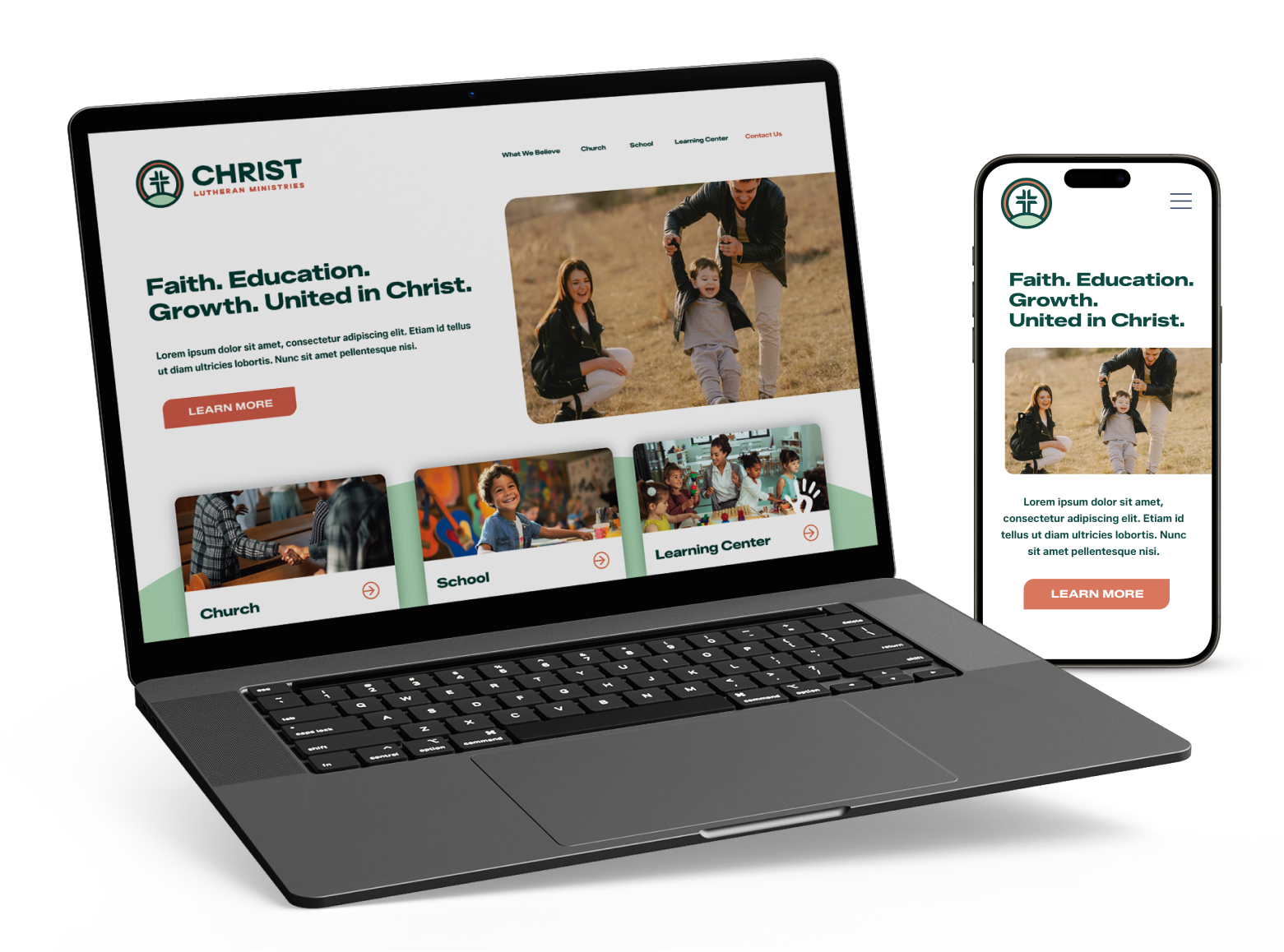
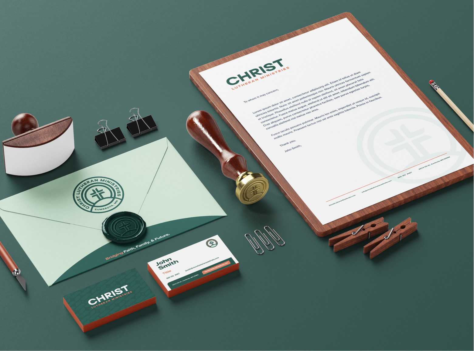
Southpaw partnered with Christ Lutheran Ministries to position the school, church, and Kids of Christ Learning Center with a strategic approach; which meant delivering a new logo and visual identity system for a brand experience that clearly and effectively communicates CLM’s mission. This also included addressing their athletics identity of the Knights; reimagining the identity with a unique and polished experience that excites and engages its students, parents, and fans.
Client:
Christ Lutheran Ministries
Project:
+ Brand Identity
+ Marketing Collateral
+ Magazine Design
January 2026

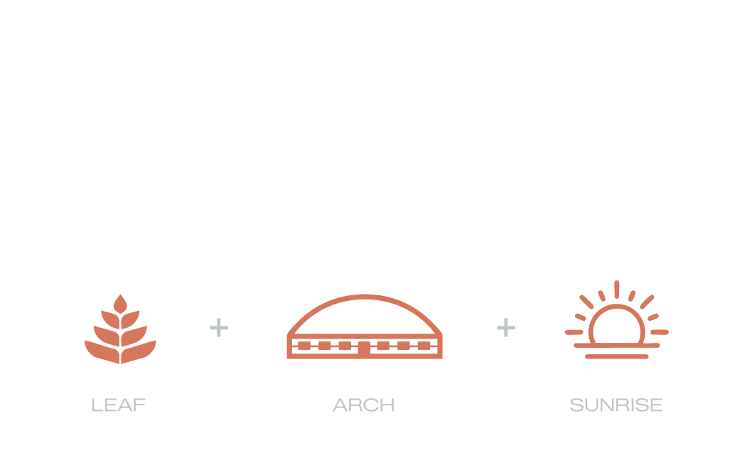
The logo at first glance is a cross divided, given a leaf-tip treatment to symbolize the growth of the students and congregation at Christ Lutheran. The arch at the bottom is inspired by the recent building project of the ministry center with the dome roof, and also more importantly to illustrate the importance of building on a sturdy foundation of Christ (as read in Matthew 7:24-27). Finally, the orange ring surrounding the cross illustrates the dawn of future generations coming over the horzion, as well as the word spreading throughout the community.
The wordmark is built off a bold and modern typeface that will encourage clarity with growth of Christ’s ministries. It is also given subtle nods and adjustments that allow it to marry with the icon.

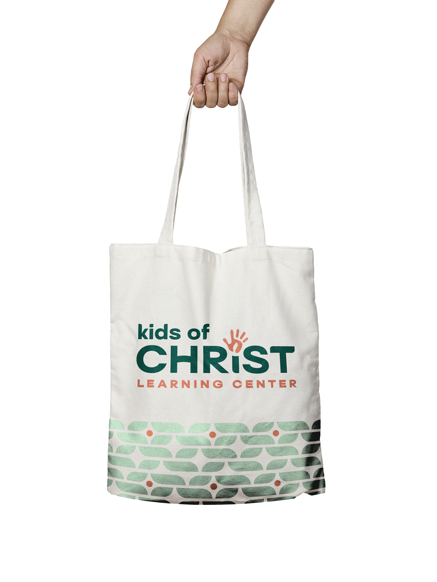
Umbrella Brand
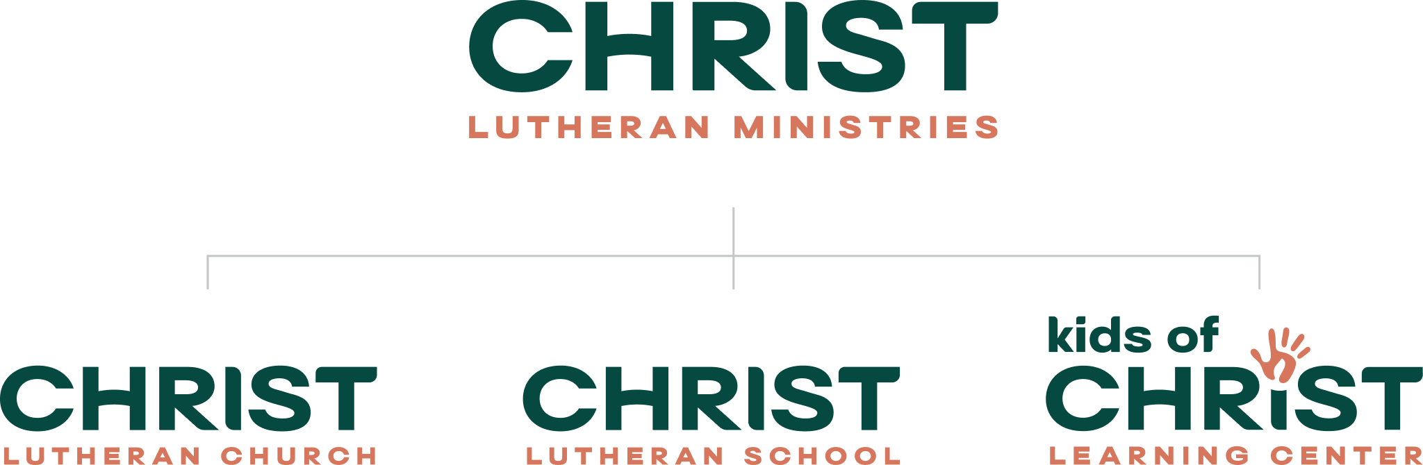
The umbrella hierarchy is communicated through the visual identity system. To keep things uniform, the sub-line is the only variable, aside from Kids of Christ Learning Center, that will have it’s own logo to stand out to appeal for the specialized services.

Designed for Generations to Come.

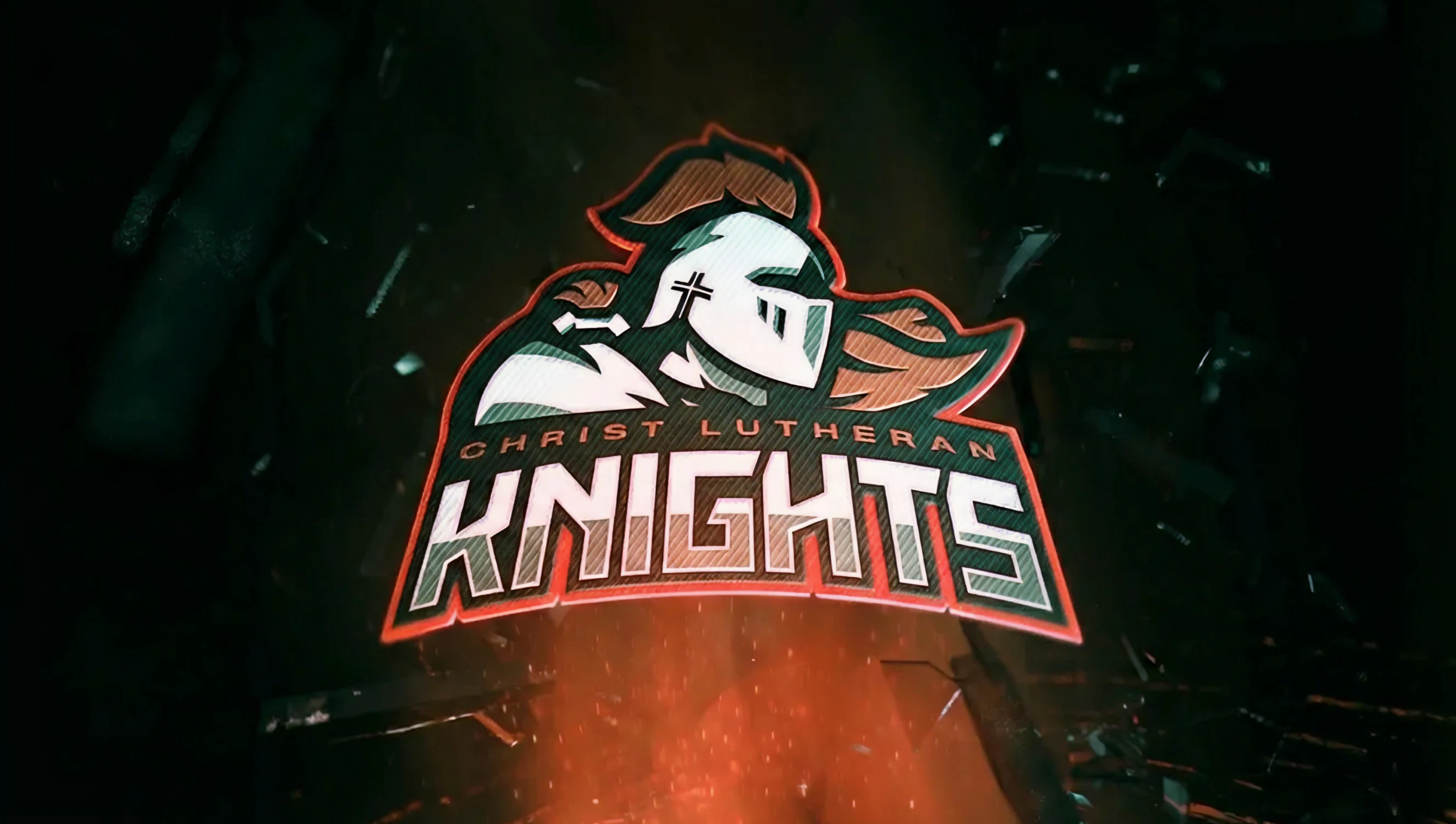
ATHLETICS REBRANDKNIGHTS
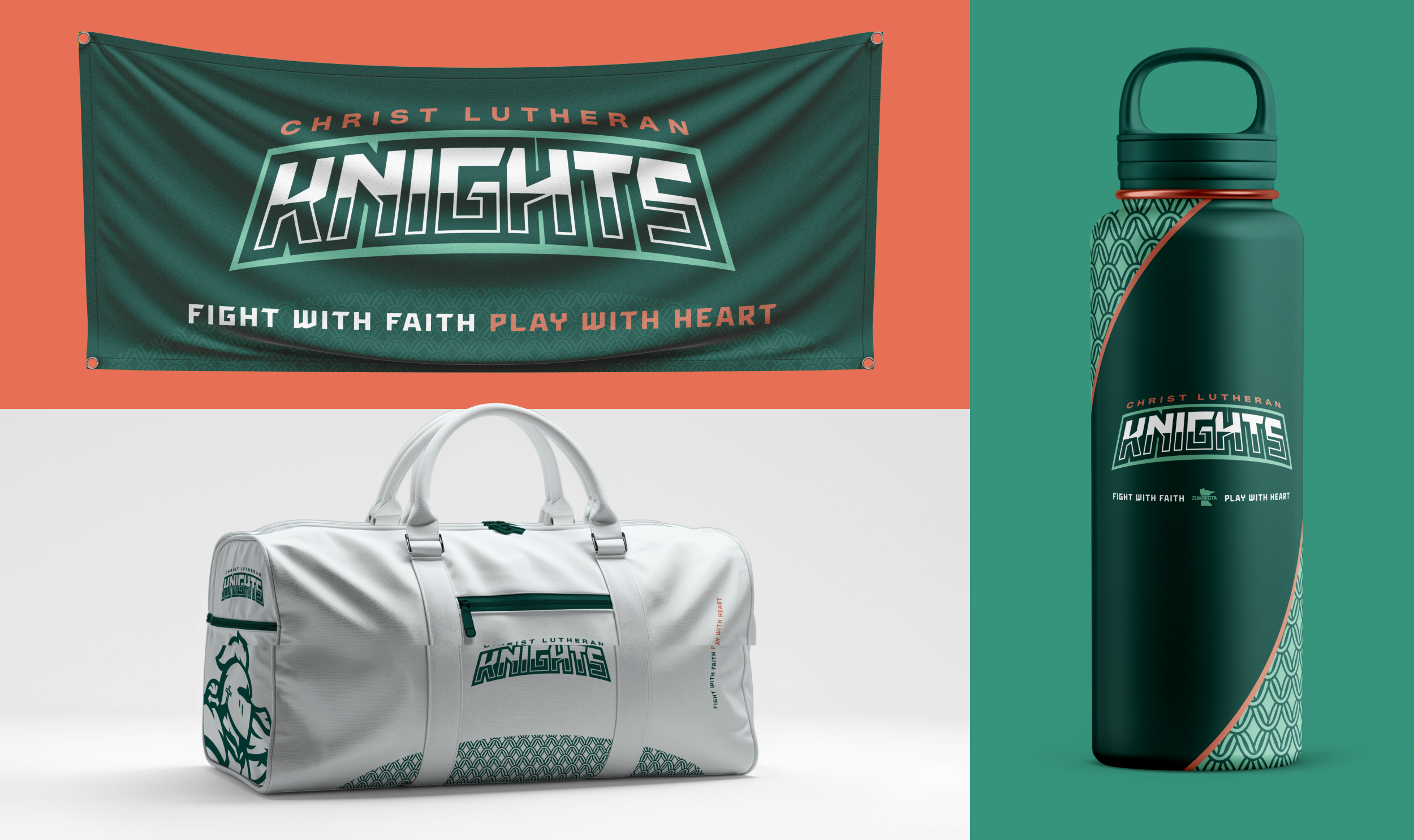
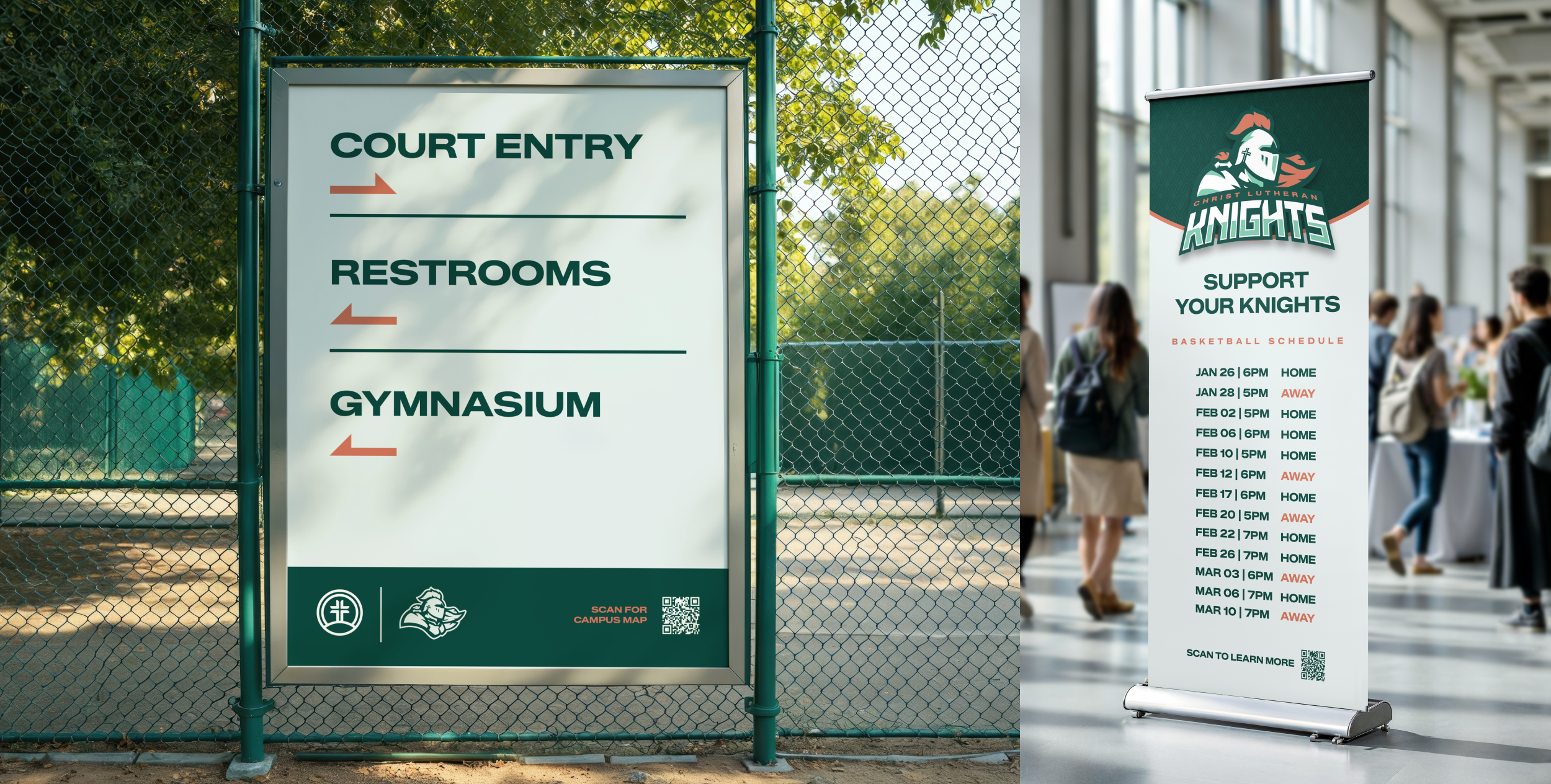
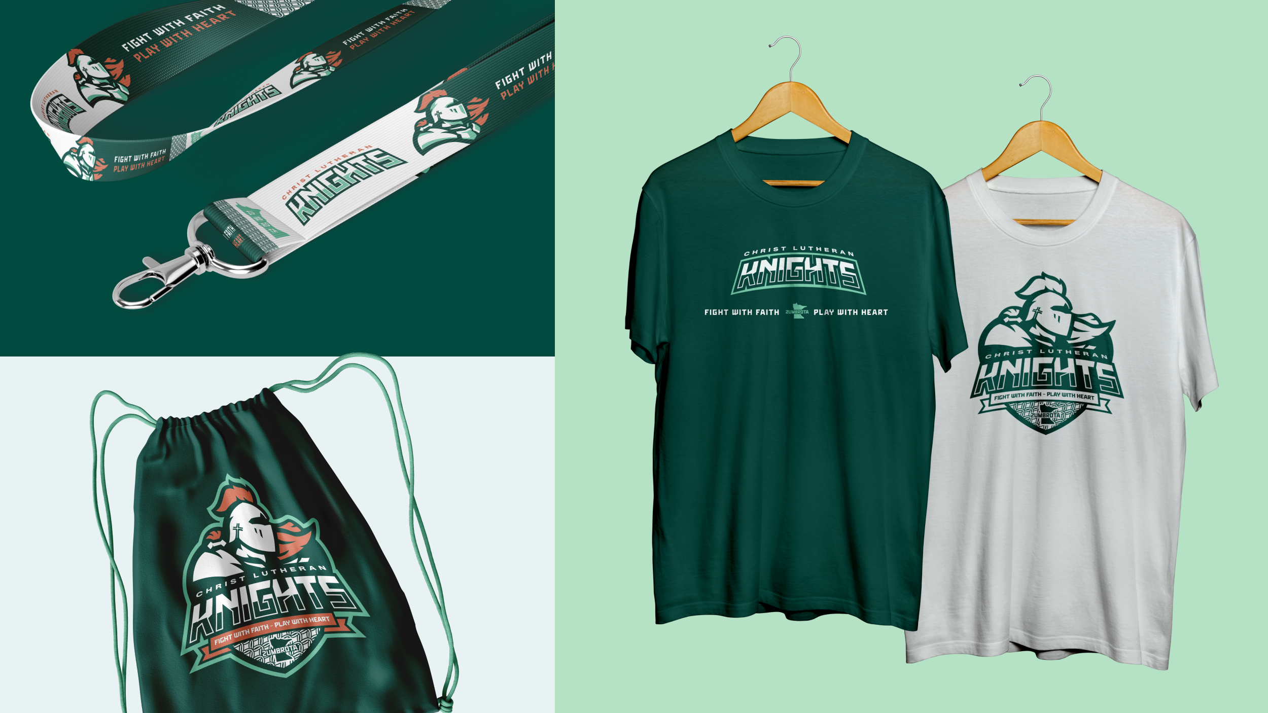
With this rebrand, we needed to build an identity that is based off strong and unique imagery that will encourage its students and supporting families to participate and attend athletic events; overall supporting Christ Lutheran as a whole. The brand experience ultimately illustrates faith, humility, trust, leadership, victory & integrity.
Going in, we wanted to avoid Knight clichés of a sword or shield, so it’s not perceived as aggressive but leans into nobility. Also with the new academics (and overall ministries) identity in place, this brand visually reflects that experience as well and tieing in identity touchpoints.

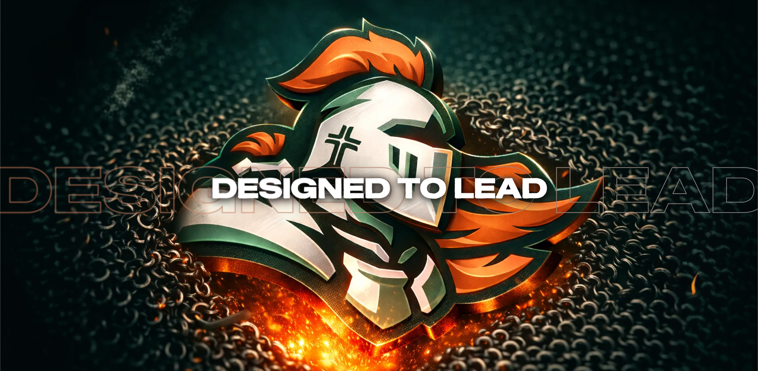

Rooted in Faith.
Ready for the Future.
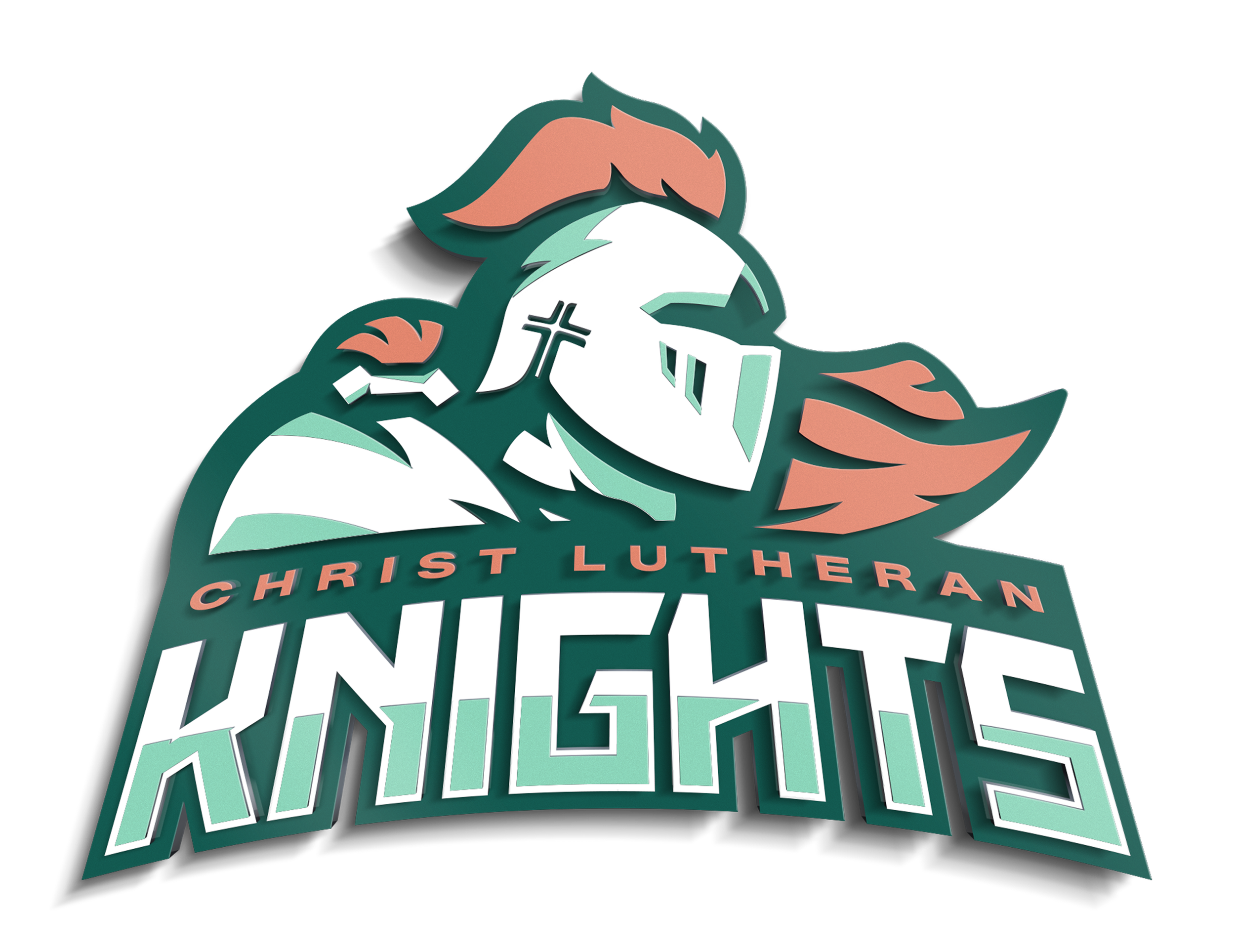
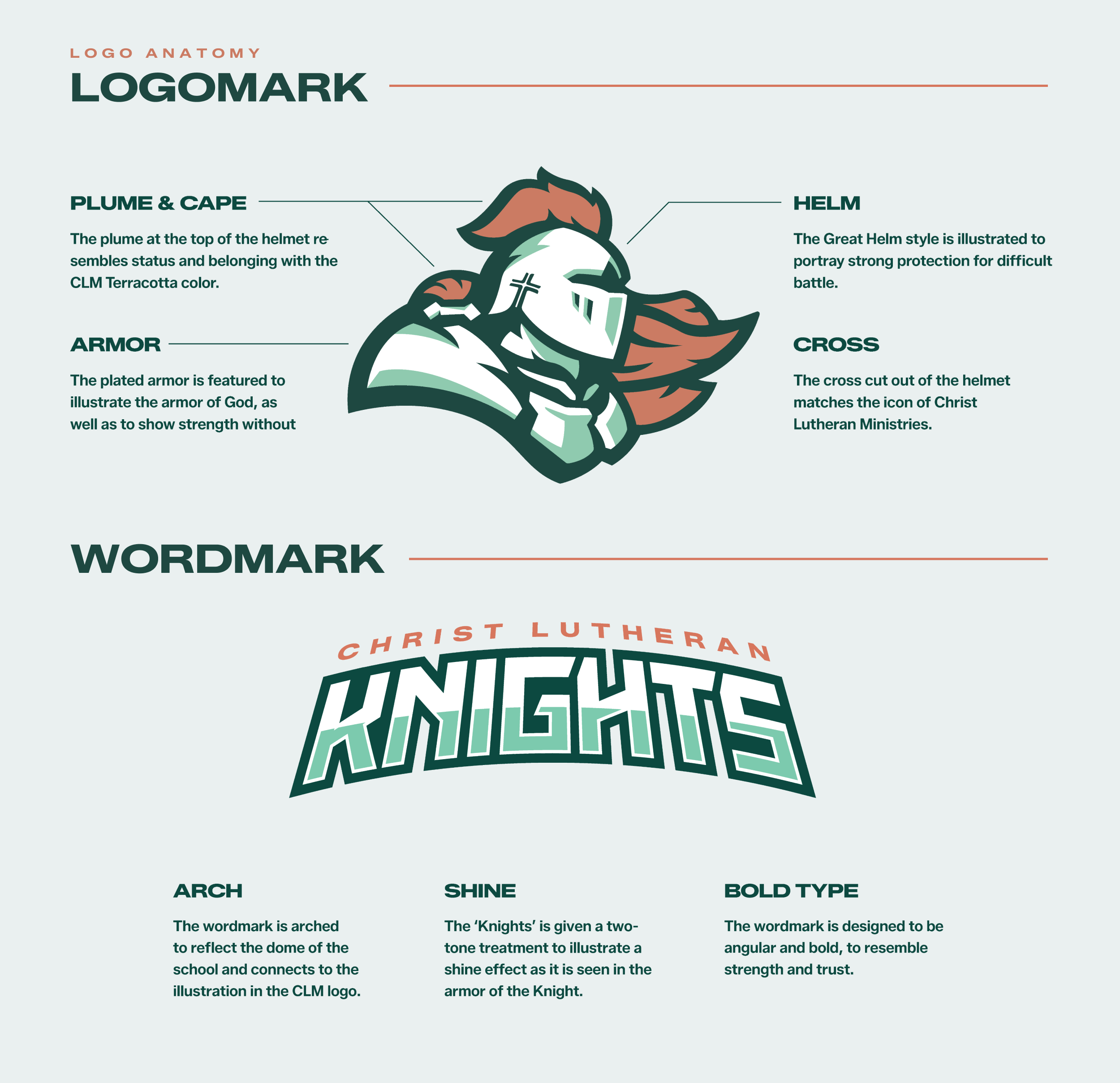
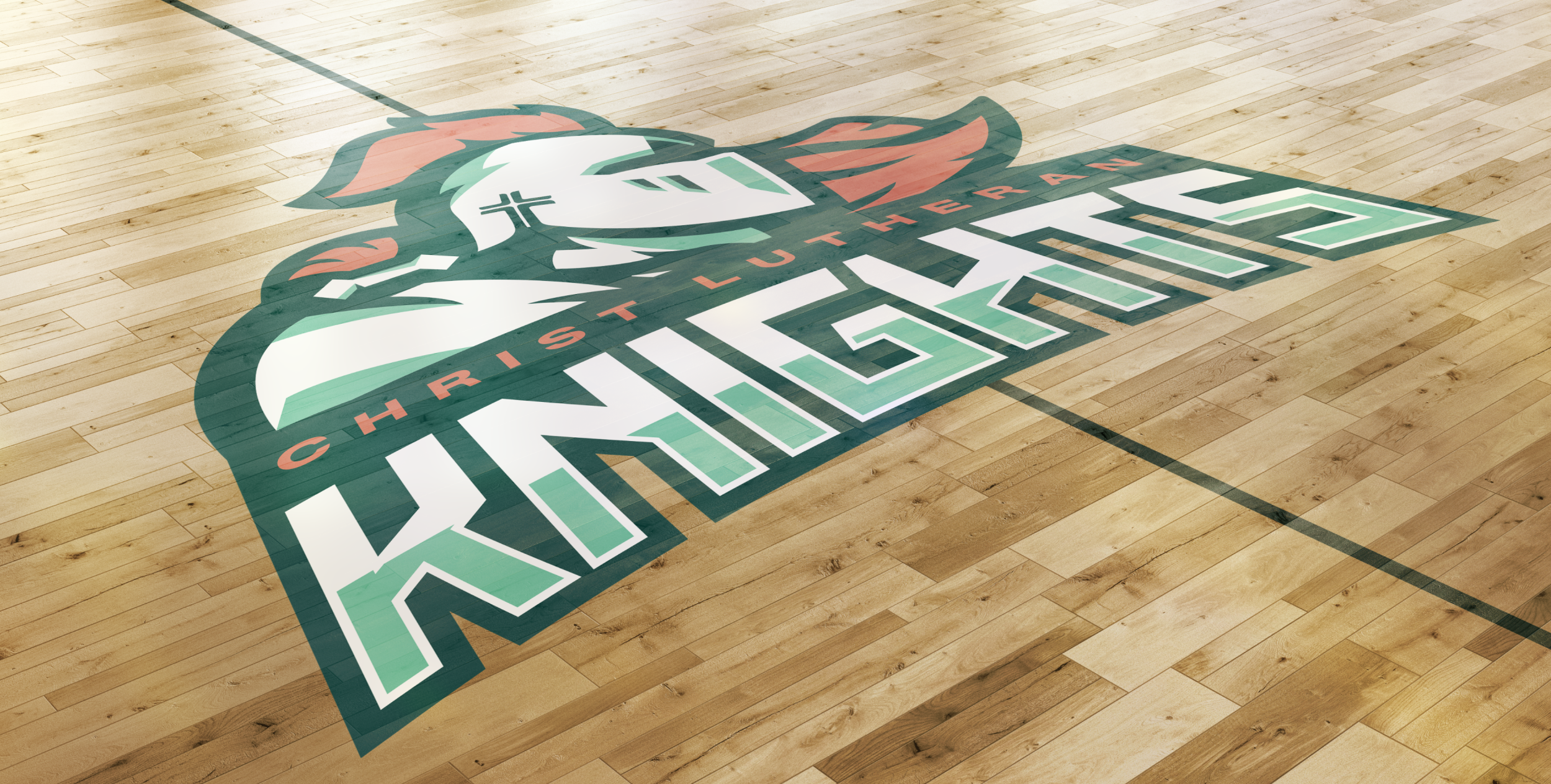
The visual identity for the Christ Lutheran Knights illustrates a noble knight that is unique while also reflecting the Christ Lutheran School identity.
The logo is firm yet friendly as it doesn’t include any clichés of swords or shields, rather it embraces the connection to CLM with the terracotta-colored plume and cape, as well as the arch theme in the wordmark.
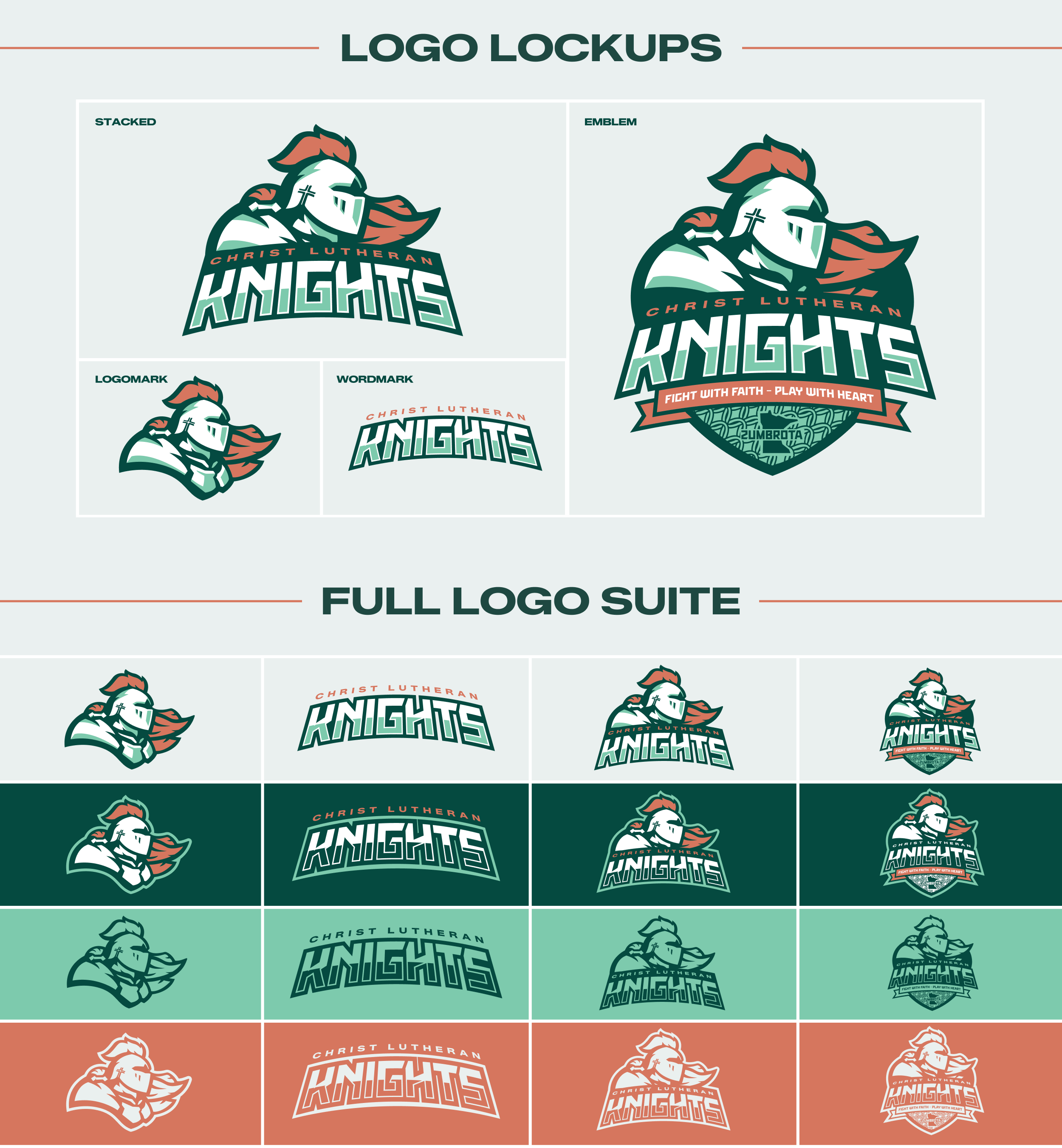
The Knights identity delivers an exciting brand experience by offering practical visual assets that result in clarity, consistency, and a unique look Christ Lutheran School can call its own.