A Modern Update for a Warm Welcome.
Client:
Bethany Lutheran College
Project:
+ Identity Design
+ Collateral Design
+ Web Design
July 2024
Bethany Lutheran College is a private Christian liberal arts college in Mankato, Minnesota founded in 1927. It was time for an identity alignment and refresh since their last identity visit in 1997.
I'm honored for this opportunity and work in tandem with BLC in concept execution for their new logo as well as building out their visual identity to align with their mission and values, as well as speak clearly and consistently to their students, staff, alumni, and supporters.

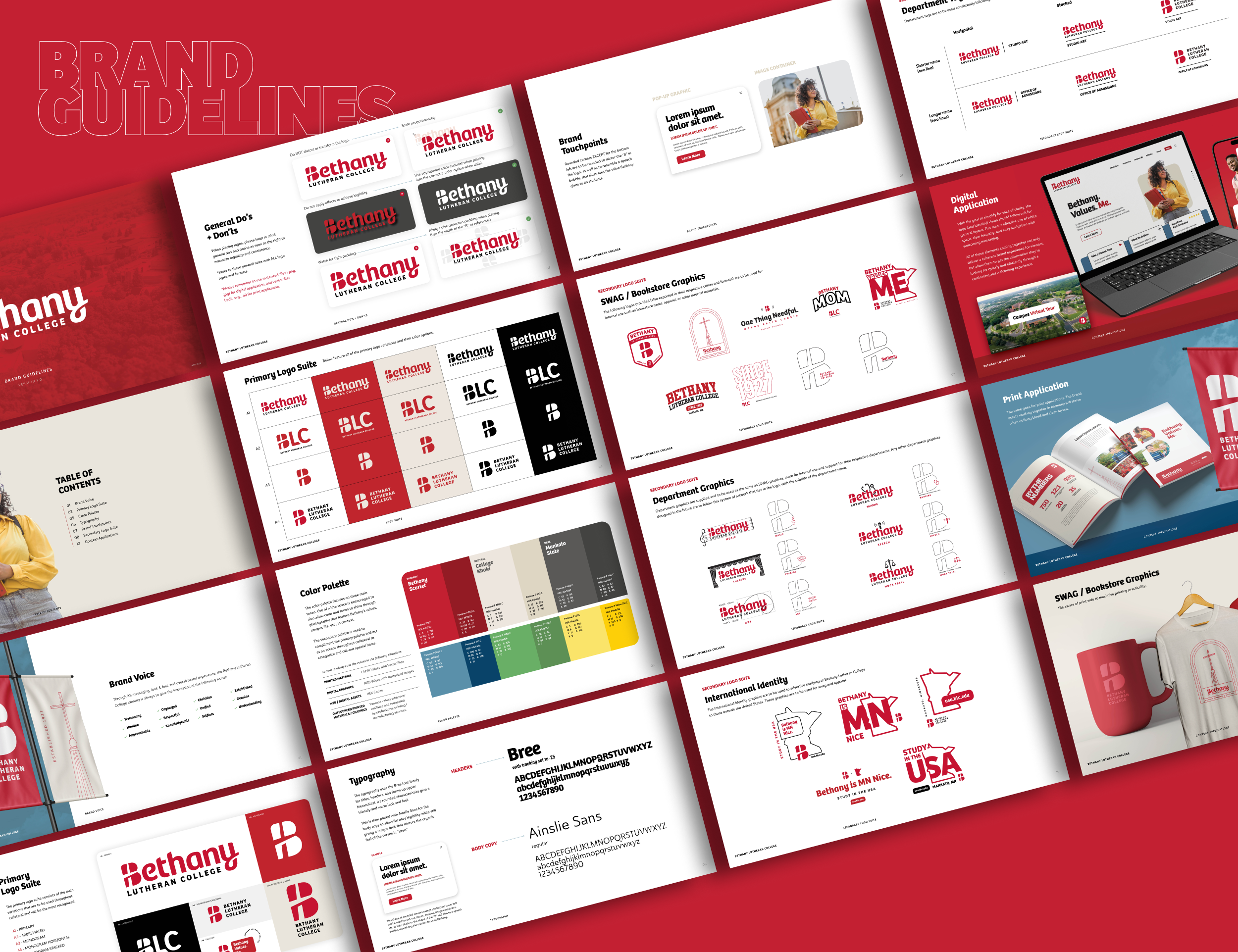
Southpaw was happy to assist Bethany Lutheran College with their revolutionary rebrand that not only revamps the logo but dial in the supporting identity elements; crafting an approachable and welcoming brand experience. We focused on a logotype of “Bethany” and having a cross in the “B” that will be able to be used on its own as an icon and other smaller scale applications. This solution nods to the steeple seen in the original logo, but introduces simplicity for practicality, clarity, and consistency.
Design Backed By Reason
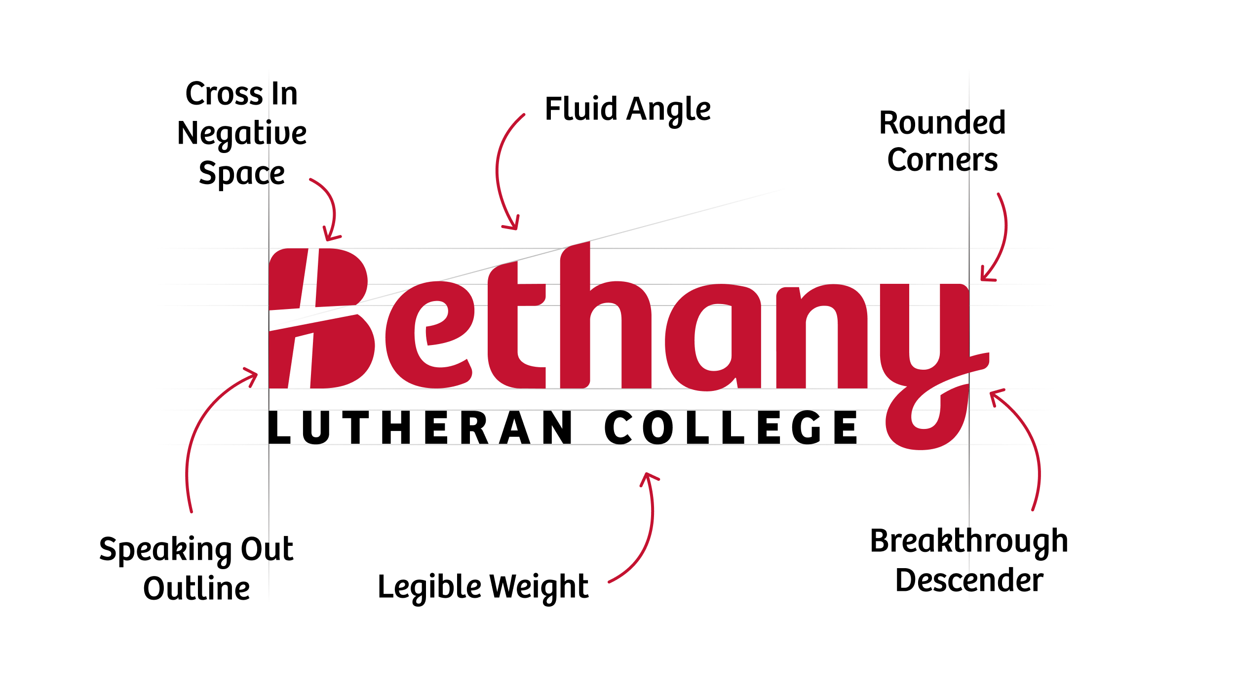
The underlying goal of this rebrand (essentially starting with the logo) was to give it a modern update that solves the concerns of practicality. The first step in simplifying the primary logo was to start reducing while ensuring that the subtracting decisions were backed by reason and still represented BLC by tying some unique characteristic to the logotype.
The steeple seen in the original logo is simplified and illustrated through the “B” in negative space to let the light shine through. The corners of the “B” are all rounded except the bottom left to illustrate a speech bubble, which is used throughout the identity as text boxes/containers to illustrate how Bethany values its students, staff, and mission in its education.


Bringing It All Together
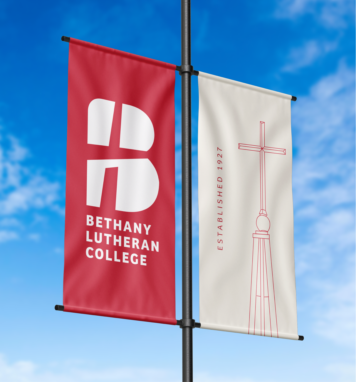
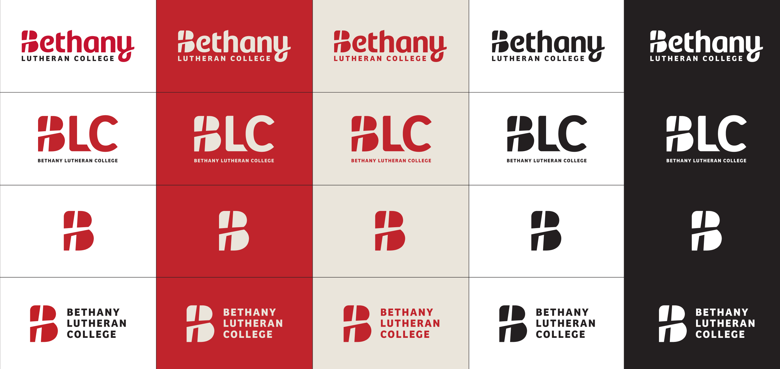
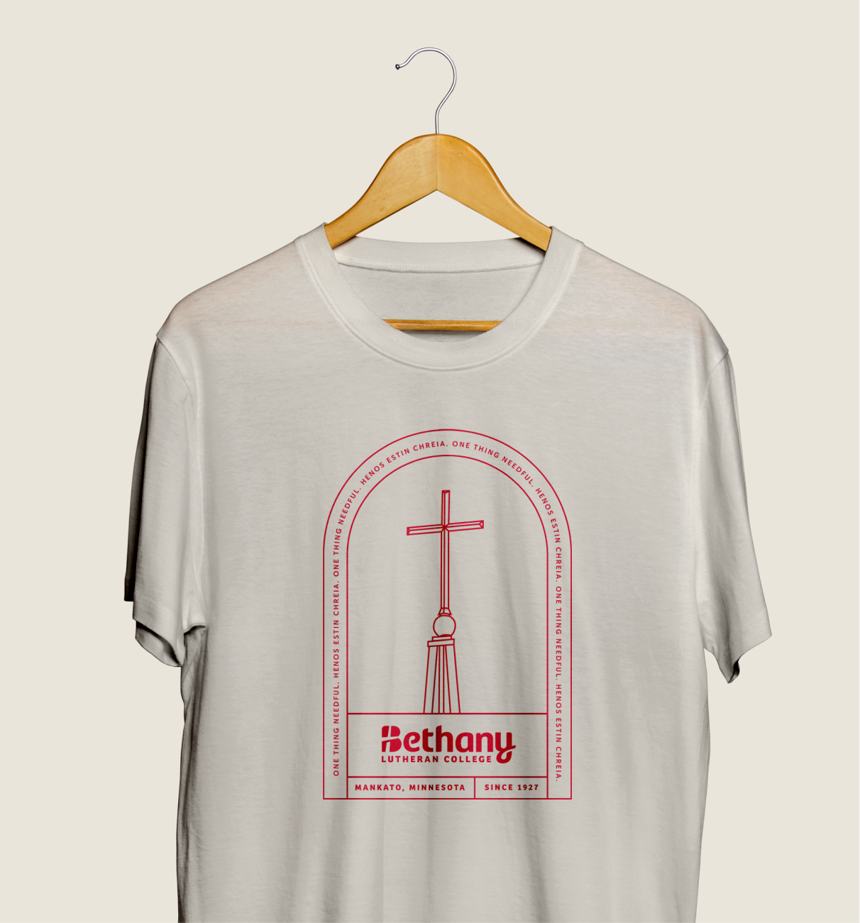
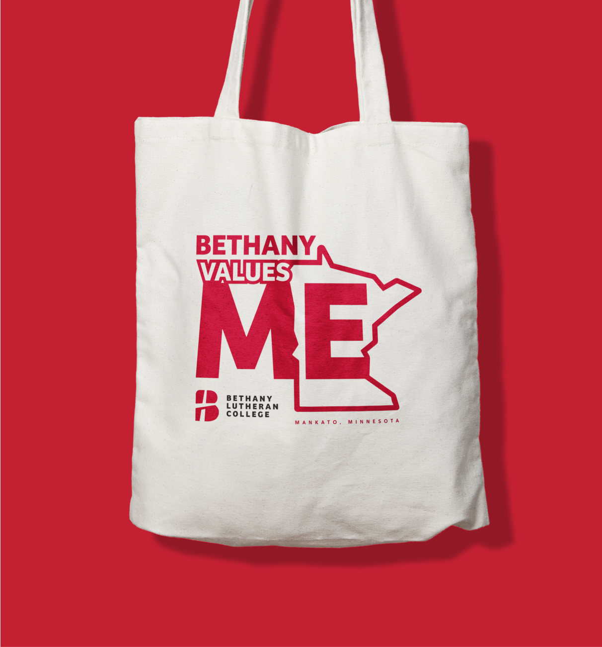
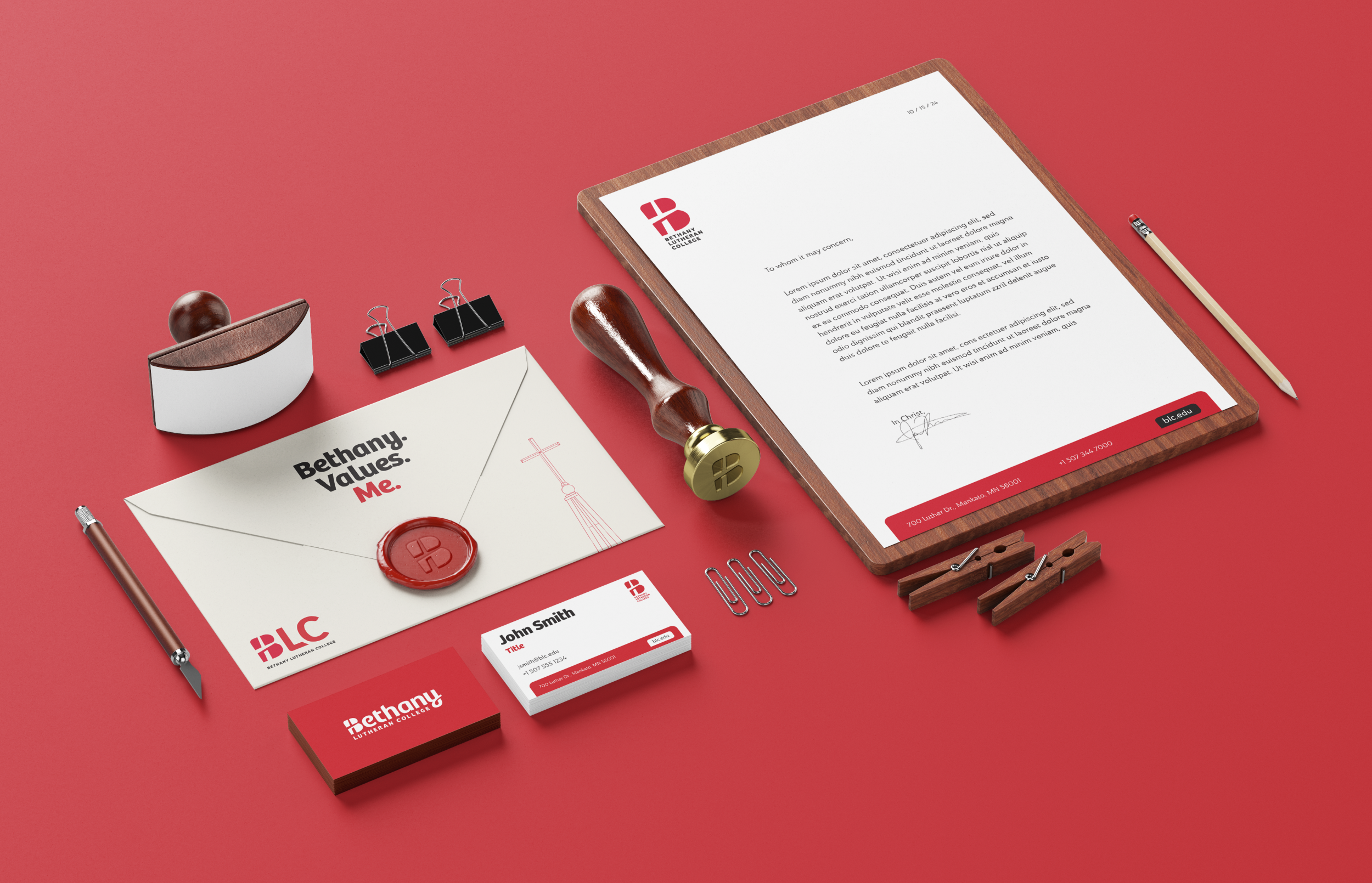
With a revised logo in place, it set the stage for the rest of the identity assets to be dialed in. We broadened the color range as well as nailed down the typography. With all of the assets coming together, the identity represents an updated look for Bethany that not only holds the values but will stand the test of time for a simple yet approachable experience.

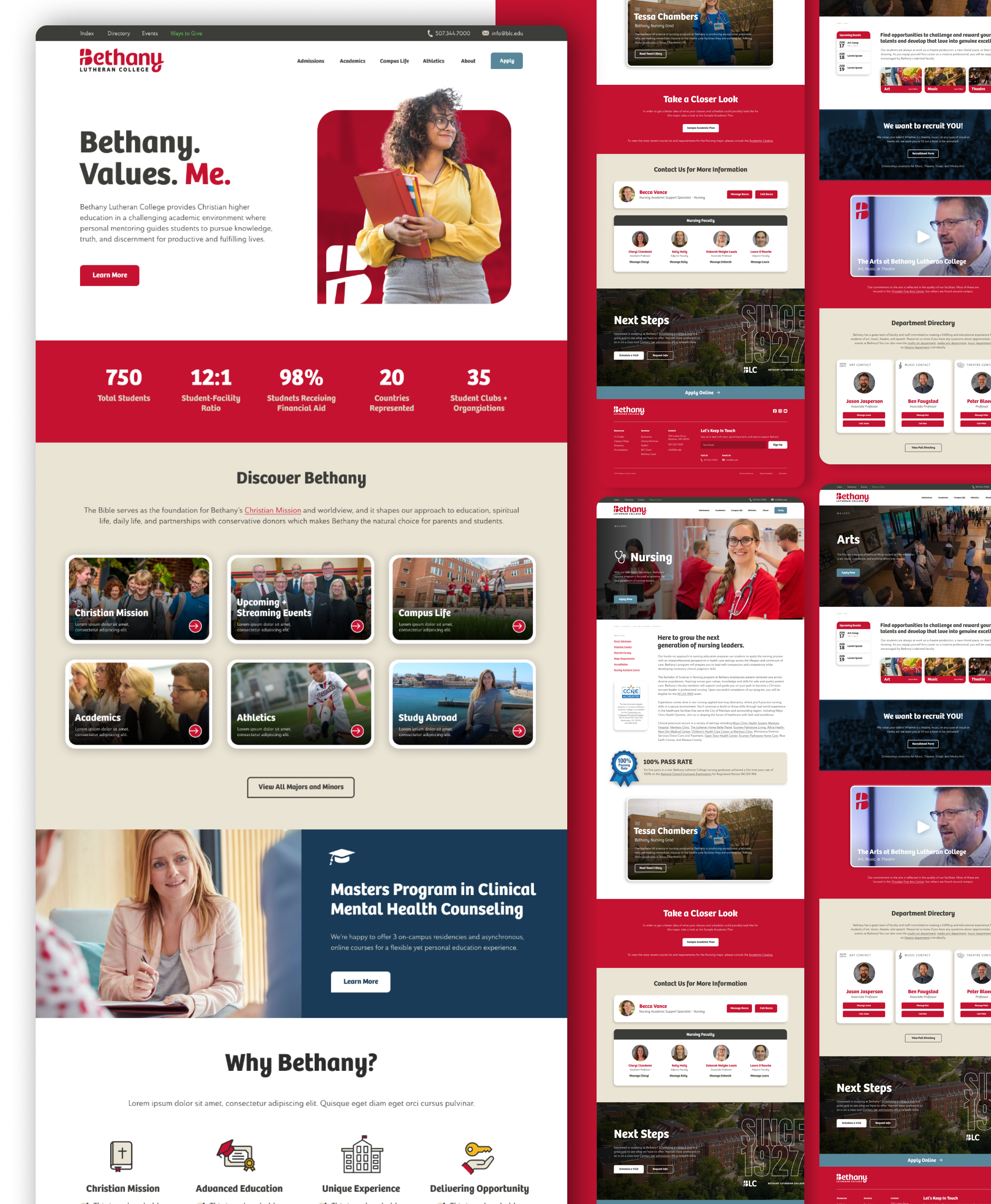
A Consistent Web Experience
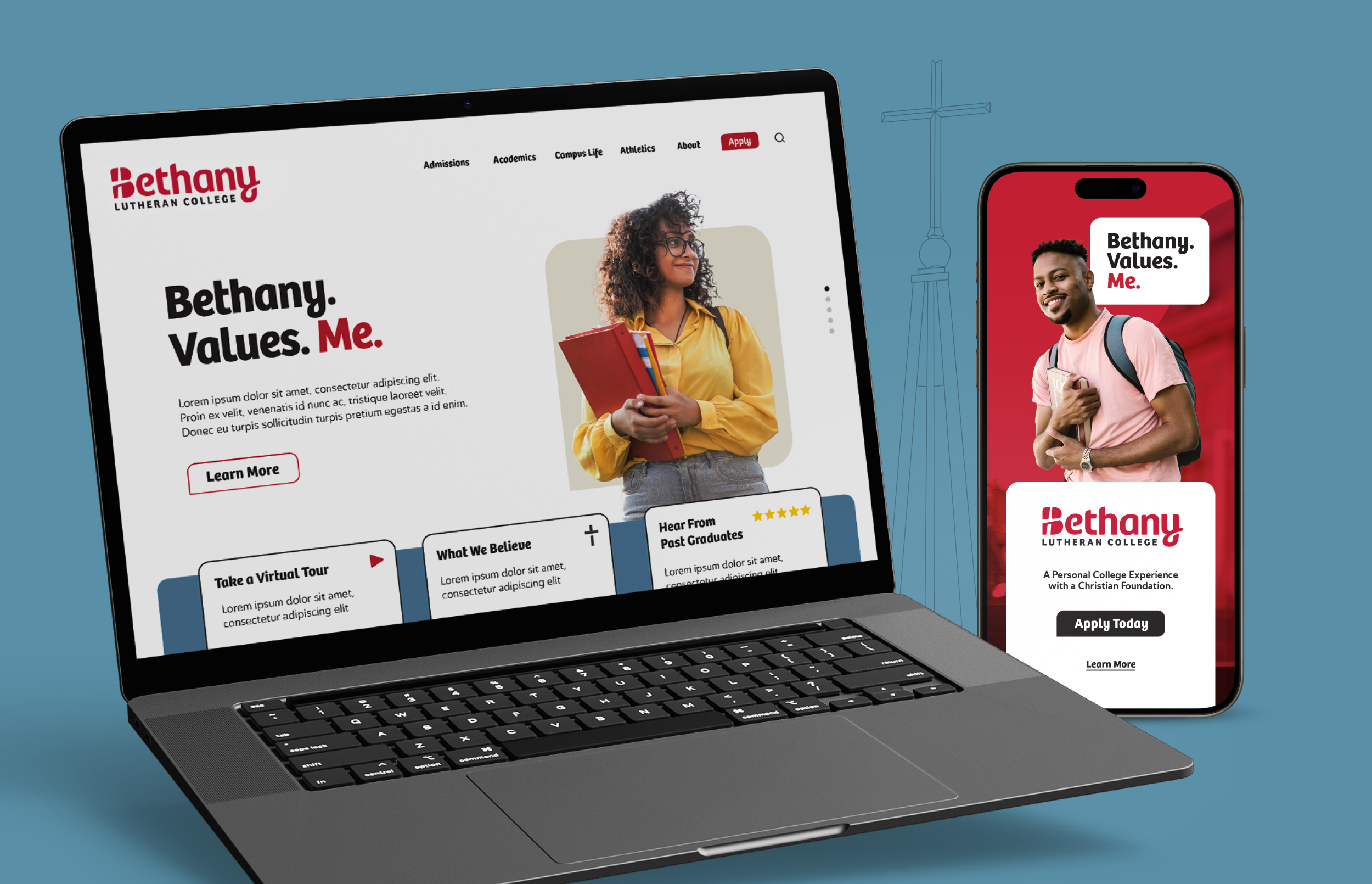
Following suit with the necessity to clarify the overall brand experience, strategic design that will highlight the capabilities of the new identity was brought to the website. This new layout introduces a bold look that will bring clear hierarchy and a consistent flow for desktop and mobile; making it easy to apply, find resources, and learn more about Bethany.
