
Built on Christ.
A Foundation
for the Future.
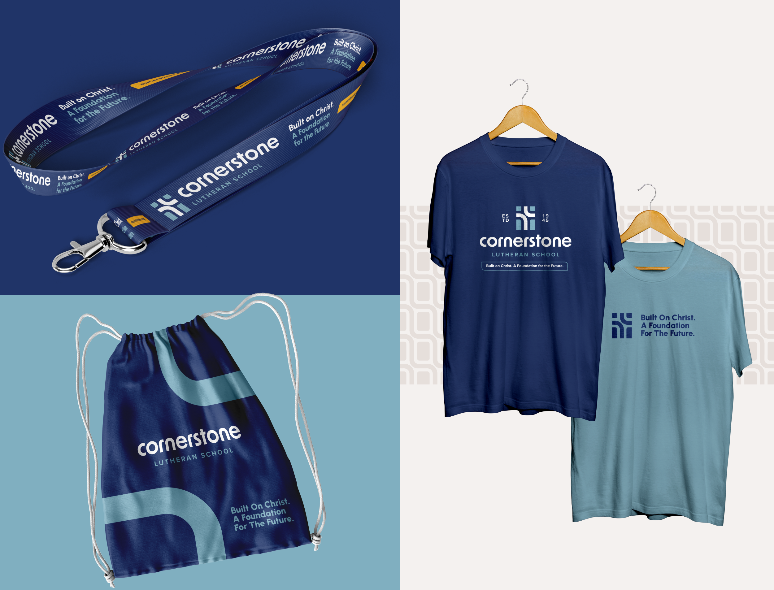
Cornerstone Lutheran School needed an identity system that represented more than just a school — it needed to communicate the unity of three congregations coming together around a shared mission of Christ-centered education, governance, and long-term sustainability. Built around the message “Built on Christ. A Foundation for the Future,” the rebrand was designed to feel welcoming, grounded, and enduring while avoiding overly literal or predictable school branding. The final identity system balances strength and approachability through purposeful visual elements that connect back to Cornerstone’s mission, creating a cohesive brand for both the school and Chargers athletics that feels meaningful, modern, and built to serve future generations.
Client:
Cornerstone Lutheran School
Project:
+ Brand Identity
+ Marketing Collateral
+ Web Design
April 2026

Christ At The Center
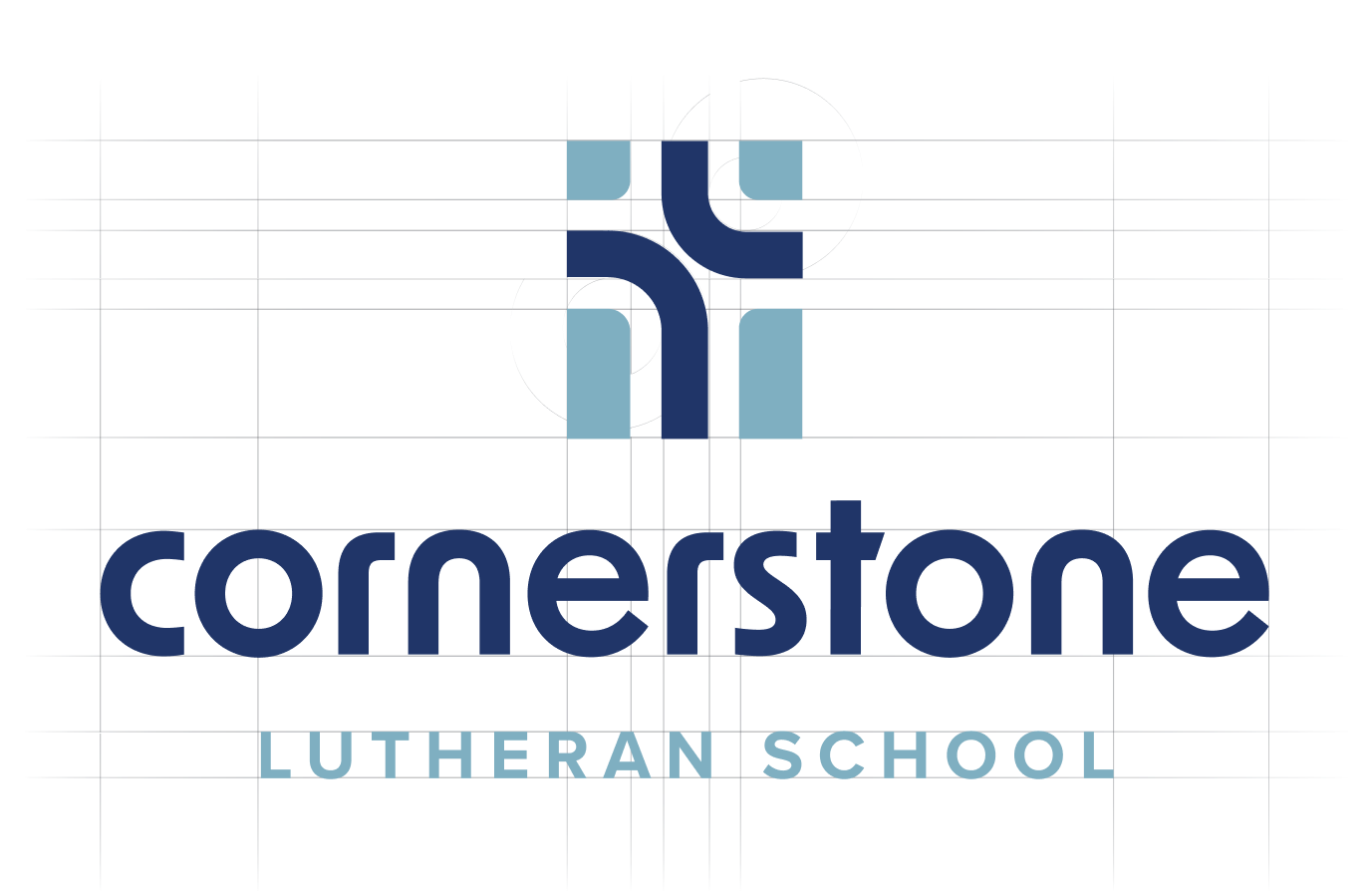
The two main curves in the middle form a cross, especially at first glance and small-scale, while the four light blue blocks fill the empty space to form a more unified shape, representing the solid foundation.
Sharing Community
The cross is designed with curves to reflect the wordmark, but also to illustrate the faith and dedication to starting at the cross and sharing that faith with the community.
Customized Type
The wordmark is brought down to all lowercase for an approachable impression. The curves mirror the icon to keep a consistent look & feel and balanced weight.


Consistency. Clarity. Practicality.
ATHLETICS REBRANDCHARGERS
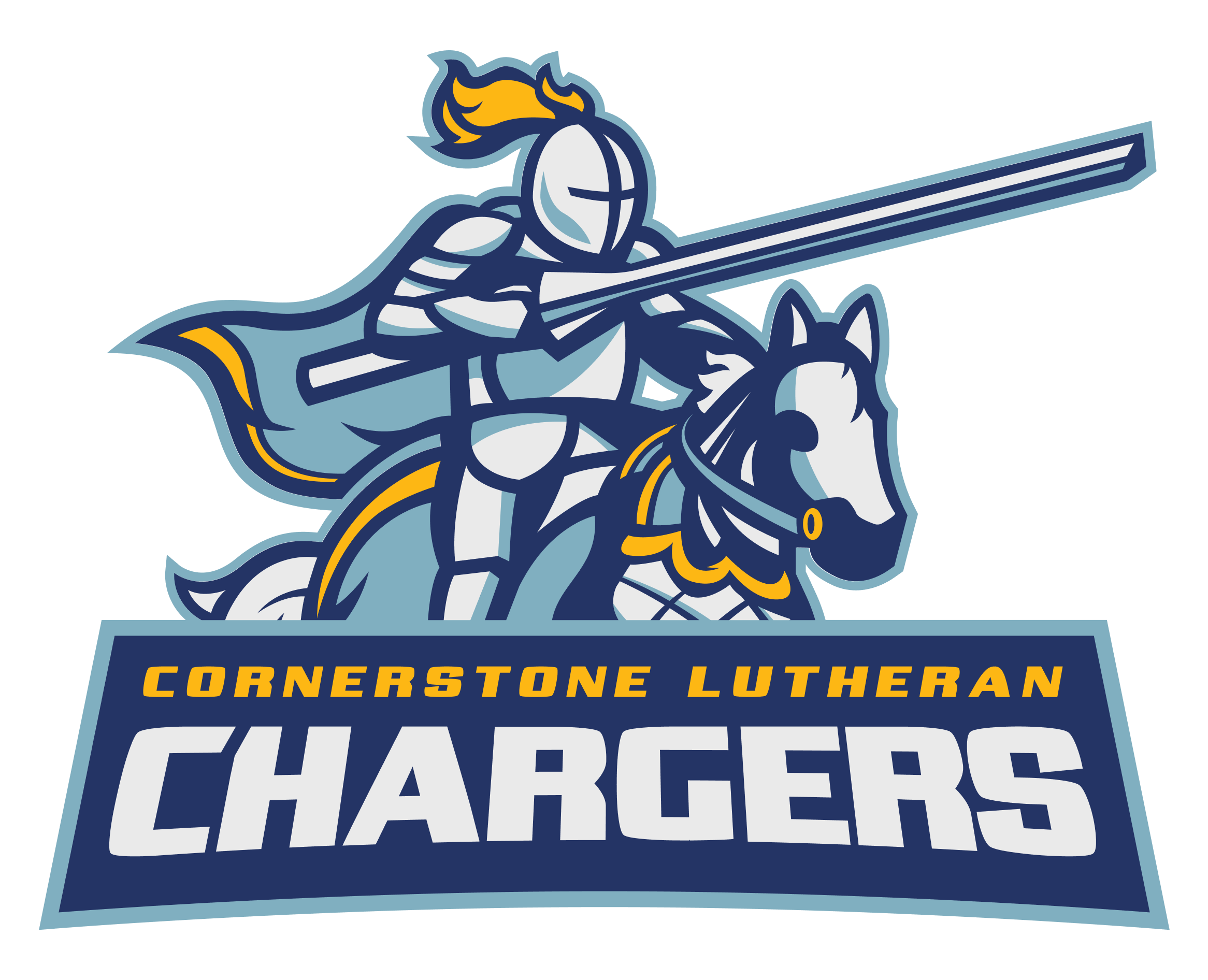
With the Chargers athletics identity, the goal was to create a system that felt bold, unified, and energizing for students, families, and supporters while reinforcing the greater Cornerstone Lutheran School mission. The brand experience was designed to communicate strength, discipline, teamwork, leadership, and Christ-centered character — creating an identity that students could rally behind both on and off the field.
From the beginning, the direction intentionally avoided overly aggressive or cliché mascot symbolism in favor of a look that felt confident, modern, and enduring. At the same time, the athletics identity was carefully built to visually connect with the broader Cornerstone academic brand system, creating consistent touchpoints across the entire school experience while still giving the Chargers their own distinct presence and energy.

FIRM IN FAITH.
CHARGING FORWARD.
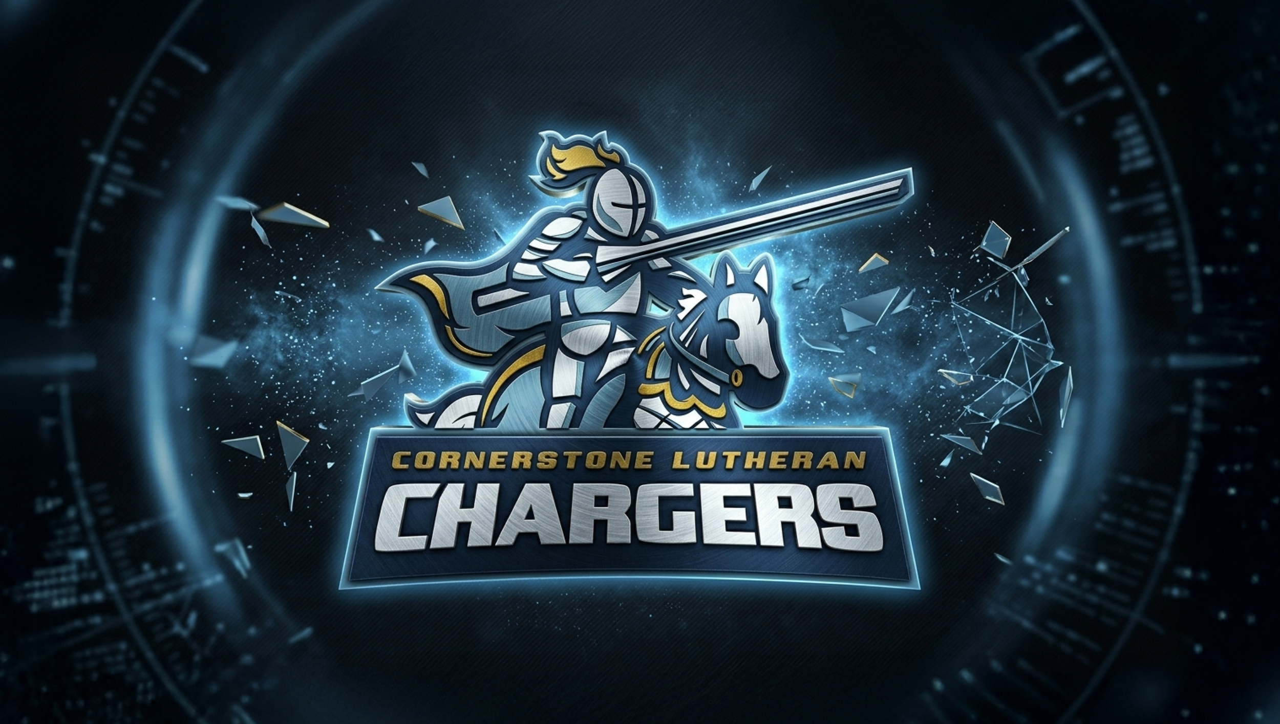
A jousting knight is kept as the subject from the previous logo to imply strength and motion for Cornerstone’s athletics. Now it is given a treatment that flexes the color palette that keeps practicality without sacrificing detail.
The plume and cape signify the belonging with a matching yellow trim while still acting as an accent and not overpowering the overall color scheme.
The wordmark is reworked to improve practicality with a simpler approach. This allows for it to pair better with the mascot so they balance each other rather than compete for attention.